
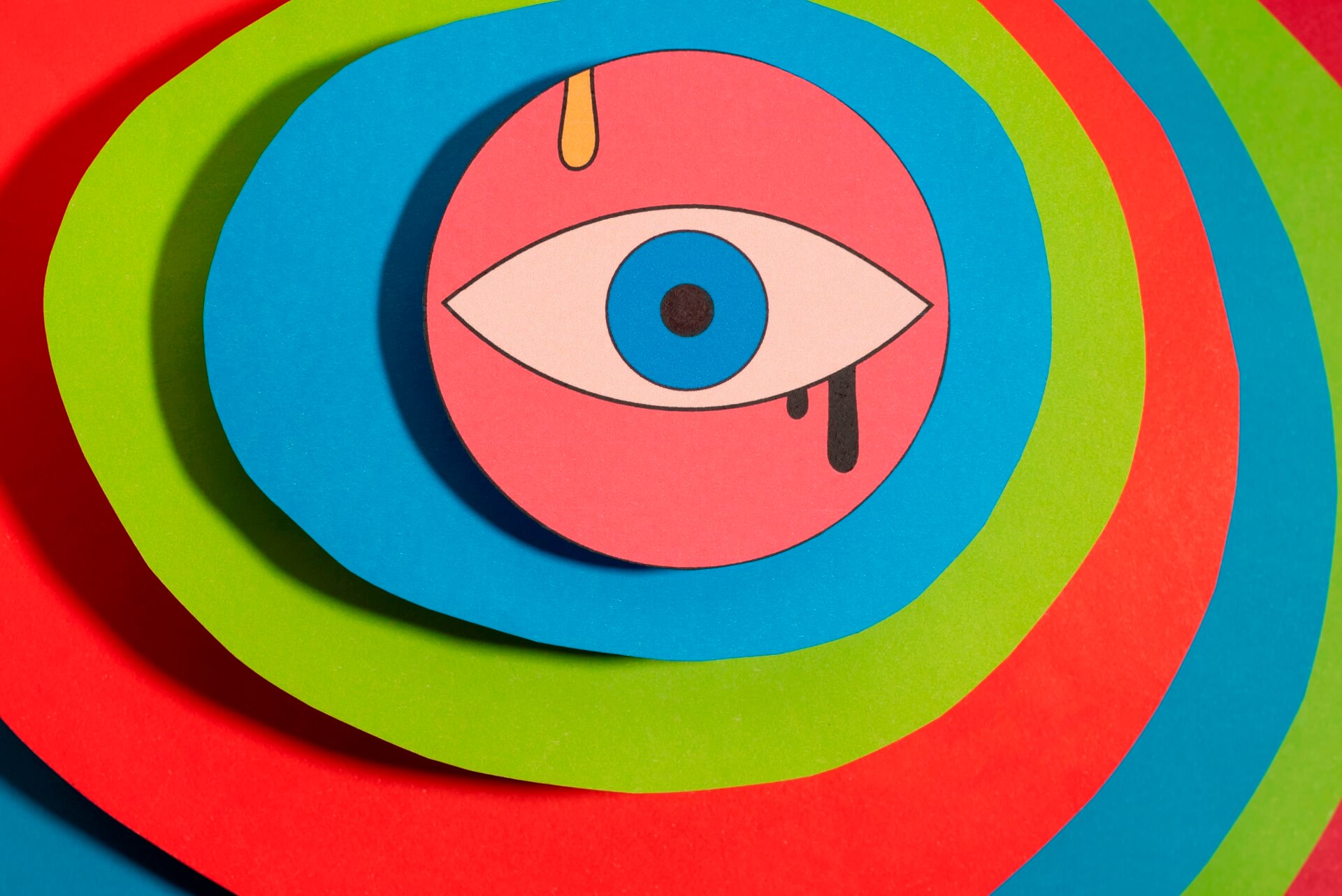
How Creative Artists Build Emotional Worlds Through Color
Unlock the secrets of how artists craft compelling emotional experiences using the power of color. Dive into the world of creative design and artistic lifestyle, exploring how visual inspiration shapes our perceptions and feelings.
The Foundation of Emotion: Understanding Color Psychology
Color is not merely a visual element; it’s a powerful language that speaks directly to our emotions and subconscious. Artists leverage this inherent connection, employing color psychology to evoke specific feelings and reactions in their audience. From the calming blues and greens to the energetic reds and yellows, each hue carries a distinct psychological weight. Understanding these associations is the first step for any artist aiming to build an emotional world within their work.
Warm vs. Cool Palettes
Warm colors (reds, oranges, yellows) tend to evoke feelings of passion, energy, happiness, and warmth. They can create a sense of intimacy or urgency. Conversely, cool colors (blues, greens, purples) often bring about feelings of calmness, serenity, sadness, or professionalism. The strategic interplay between warm and cool palettes can create dynamic tension or harmonious balance, guiding the viewer’s emotional journey.
Visual Inspiration as a Catalyst for Emotional Resonance
Where do artists find the inspiration to translate emotions into visual form? Visual inspiration is drawn from countless sources: the natural world, personal experiences, cultural influences, and even the works of other artists. This raw material is then filtered through the artist’s unique perspective and translated using their chosen medium and, crucially, their mastery of color. The goal is to create a visual narrative that resonates deeply with the viewer on an emotional level.
Nature’s Palette: A Constant Source
The intricate and varied color schemes found in nature serve as an inexhaustible wellspring of inspiration. The vibrant hues of a sunset, the subtle shades of a forest canopy, or the bold patterns of a tropical bird all offer lessons in color harmony and contrast. Artists often study these natural occurrences to understand how colors interact and how they can be adapted to convey specific moods or atmospheres.
Crafting Emotional Worlds: Techniques and Applications
Building an emotional world through art involves more than just picking pretty colors. It’s a deliberate process of selection, combination, and application. Artists consider not only the hue but also the saturation (intensity), value (lightness/darkness), and the relationships between colors within a composition.
- Creating atmosphere: Using dominant cool tones to depict a somber or tranquil scene, or warm, saturated colors for a lively and energetic environment.
- Symbolic meaning: Assigning specific colors to represent abstract concepts like love (red), purity (white), or melancholy (blue).
- Guiding the eye: Employing contrasting colors to draw attention to focal points and direct the viewer’s emotional focus.
- Building depth and dimension: Utilizing color variations to create illusions of space and form, enhancing the perceived reality of the emotional world.
The Artistic Lifestyle: Living in Color
For many creatives, the artistic lifestyle is intrinsically linked to a heightened awareness and appreciation of color. It’s about seeing the world not just as it is, but as a canvas of potential emotions and expressions. This mindful engagement with color extends beyond their artwork, influencing their personal spaces, fashion choices, and overall perception of beauty. It’s a continuous exploration of how color shapes experience.
Conclusion: The Enduring Power of Color in Art
The ability of artists to build emotional worlds through color is a testament to the profound connection between vision and feeling. By understanding color psychology, drawing inspiration from diverse sources, and employing deliberate artistic techniques, creators can craft experiences that move, inspire, and connect with audiences on a deeply personal level. The artistic lifestyle embraces this power, making color an integral part of both creative expression and everyday life.
What are your favorite color combinations that evoke strong emotions? Share your thoughts in the comments below!