
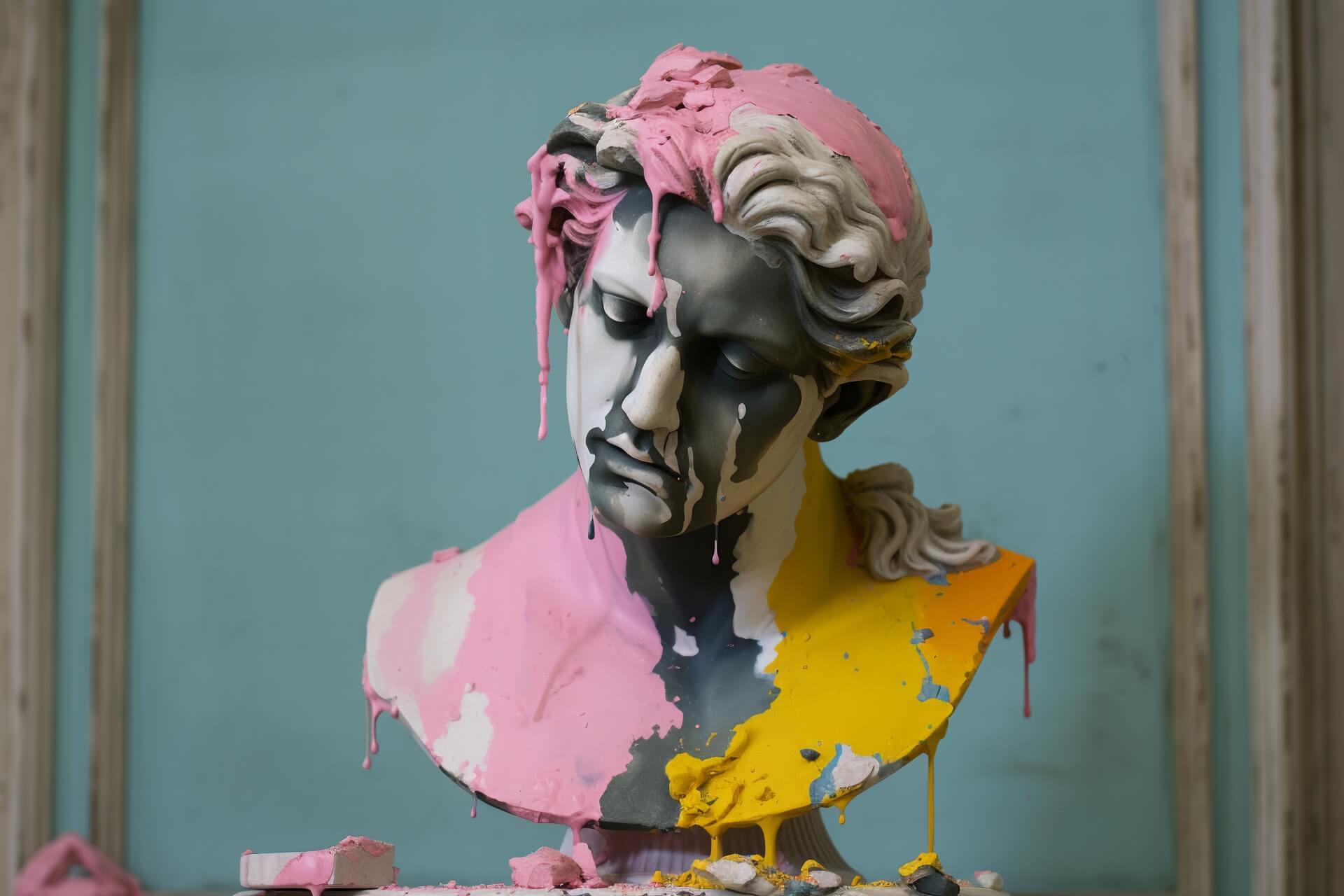
How Color Palettes Shape Emotional Experiences in Art
Step into the vibrant world of art and discover the powerful, often subconscious, influence that color palettes wield over our emotions. From the deepest blues of melancholy to the fiery reds of passion, colors are not merely visual elements; they are potent tools that artists employ to communicate, evoke, and transform our aesthetic experiences. This exploration delves into the intricate relationship between color psychology and artistic expression, unveiling how hues and shades shape our perception and feelings when engaging with art.
The Psychology of Color in Artistic Expression
Color is a fundamental aspect of visual communication, deeply ingrained in human psychology. Different colors trigger distinct emotional and psychological responses, a phenomenon artists expertly leverage to guide the viewer’s interpretation and emotional journey. Understanding color theory is crucial for appreciating the depth of an artwork; it’s not just about aesthetics, but about the underlying emotional narrative being woven.
Evoking Specific Emotions Through Color
Certain colors are universally associated with particular feelings. Warm colors like red, orange, and yellow often evoke feelings of energy, passion, joy, and sometimes anger or danger. They tend to advance visually, drawing the viewer’s attention. Conversely, cool colors such as blue, green, and purple often convey calmness, serenity, sadness, or introspection. These colors tend to recede, creating a sense of space and tranquility. Neutral colors like black, white, gray, and brown can serve as grounding elements or convey sophistication, emptiness, or formality.
How Artists Use Color Palettes for Impact
The strategic selection and combination of colors within a palette are what truly define the emotional tone of an artwork. Artists don’t choose colors haphazardly; they are deliberate in their choices to achieve a specific impact.
- Monochromatic Palettes: Using variations of a single color can create a sense of harmony, unity, and intense focus on a particular mood or subject. This approach often leads to a sophisticated and cohesive aesthetic experience.
- Analogous Palettes: Colors that sit next to each other on the color wheel (e.g., blues and greens) create a sense of calm, harmony, and visual flow. They are pleasing to the eye and can evoke naturalistic scenes or peaceful moods.
- Complementary Palettes: Colors directly opposite each other on the color wheel (e.g., red and green, blue and orange) create high contrast and visual excitement. Artists use these combinations to make elements stand out, convey dynamism, tension, or vibrancy.
- Triadic Palettes: Utilizing three colors evenly spaced on the color wheel provides a balanced yet vibrant composition. This can lead to lively and energetic artworks that are still harmonious.
Color as a Tool for Visual Storytelling
Beyond evoking general emotions, color palettes are instrumental in visual storytelling. The choice of colors can define the time of day, the setting, the characters’ internal states, and the overall narrative arc. A shift in color palette throughout a series or within a single piece can signal a change in mood, plot development, or thematic emphasis, enriching the viewer’s engagement with the story being told.
The Aesthetic Experience and Color Perception
Our individual experiences, cultural backgrounds, and personal associations with colors all play a role in how we perceive and react to them in art. While there are general psychological responses, the subjective nature of perception means that a color palette can resonate differently with each viewer. This interplay between the artist’s intention and the viewer’s interpretation is what makes the aesthetic experience so rich and personal.
In conclusion, color palettes are far more than just decorative elements in art; they are sophisticated instruments that artists use to communicate emotions, guide perception, and create compelling visual narratives. By understanding the psychology of color and the various ways artists employ different palettes, we can deepen our appreciation for the complexities and richness of artistic expression, leading to a more profound and meaningful aesthetic experience.
What are your favorite color palettes in art and what emotions do they evoke in you? Share your thoughts in the comments below!